{Givell}

{Givell}

{Givell}

Givell is a web application designed for content creators, enabling them to receive donations through task completion. This marks my first startup venture, where my co-founder Klym and I aimed to enhance the lives of content creators by helping them generate additional revenue and fostering direct engagement with their audiences. In this project, both Klym and I contributed to the design process.

{Key Highlights}

{Key Highlights}

  • Developed Givell's branding, including colour schemes, logo, and brand fonts.

  • Created comprehensive design systems and platform designs.

  • Iteratively refined the landing page to enhance the click-through rate and improve the overall explanation of Givell's purpose. Notably, the initial version of the Givell website received an Honourable Mention at Awwwards.

  • Designed and recorded marketing content, with Klym handling video editing.

{Deep Dive: Landing Page}

{Deep Dive: Landing Page}

Creation of a landing page that clearly explains Givell's innovative donation solution through tasks, while achieving a strong click-through rate (CTR) from marketing content.

Creation of a landing page that clearly explains Givell's innovative donation solution through tasks, while achieving a strong click-through rate (CTR) from marketing content.

In the first iteration, we launched an interactive, visually striking website designed to impress content creators and earned an Honourable Mention at Awwwards. Despite increased traffic, the audience wasnt relevant, and users found the site overwhelming and unclear about the products purpose. Insights from user feedback, heatmaps, and session recordings led us to reassess the design and messaging strategy.

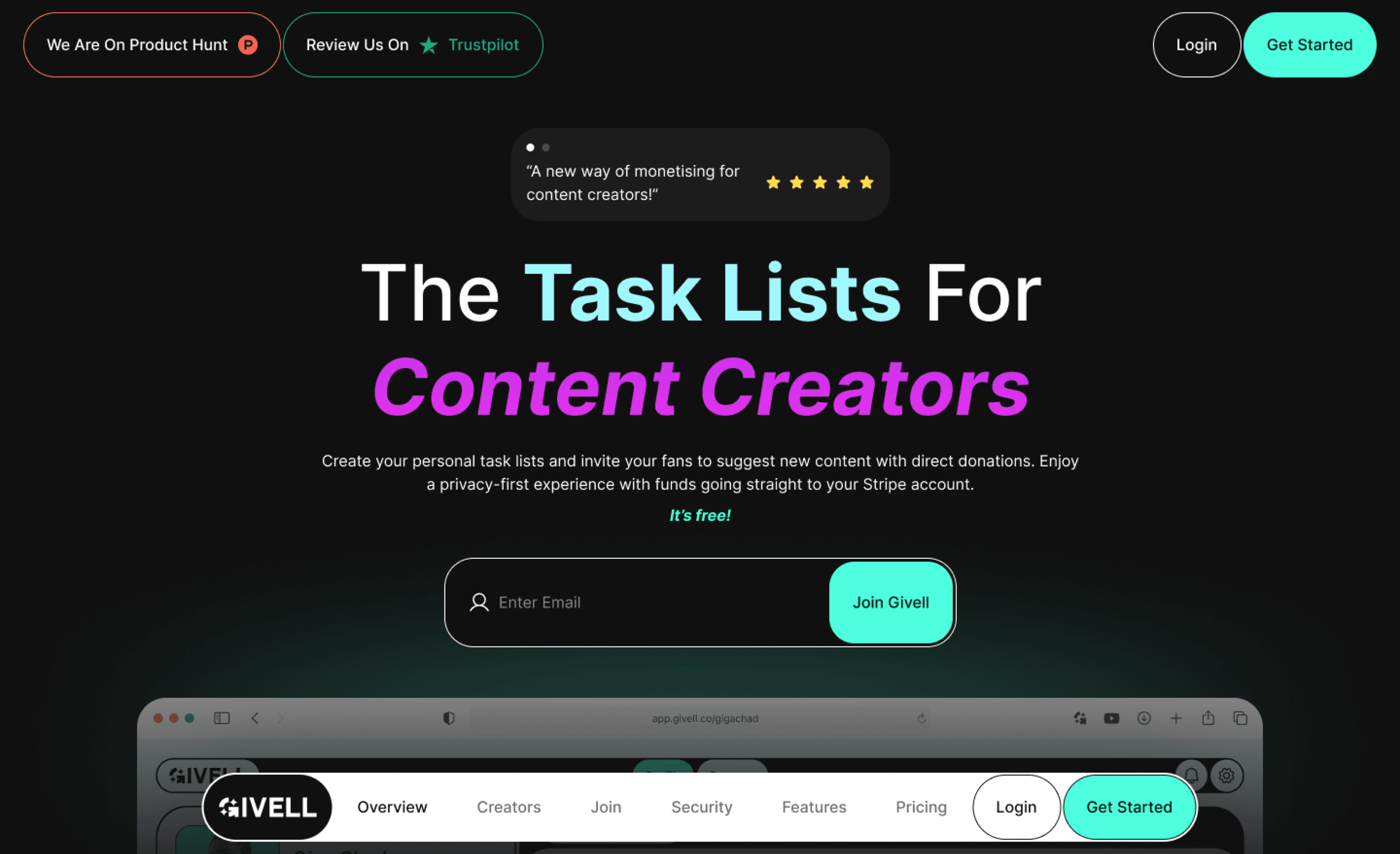
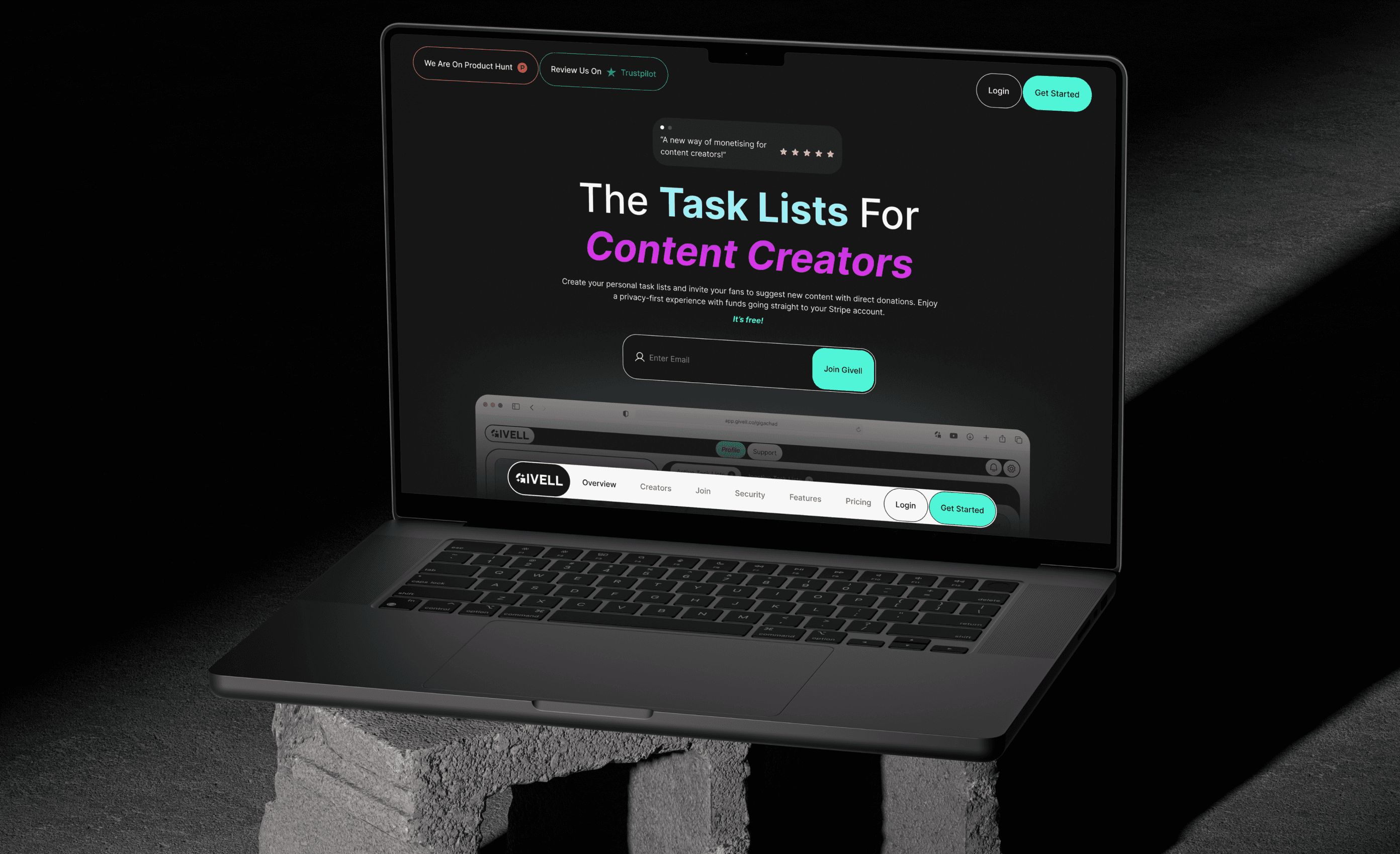
We redesigned the site with a more familiar layout and refined copy, making the product easier to understand. This led to a 5% increase in conversion and a surge in beta access requests.

{Deep Dive: Web App}

{Deep Dive: Web App}

To accelerate market entry, we prioritised UI design, using early assumptions and experience to shape the initial platform. The interface was built with clarity and usability in mind, guiding users intuitively through the experience. This enabled rapid feedback and continuous improvement, boosting engagement and usability.

To accelerate market entry, we prioritised UI design, using early assumptions and experience to shape the initial platform. The interface was built with clarity and usability in mind, guiding users intuitively through the experience. This enabled rapid feedback and continuous improvement, boosting engagement and usability.

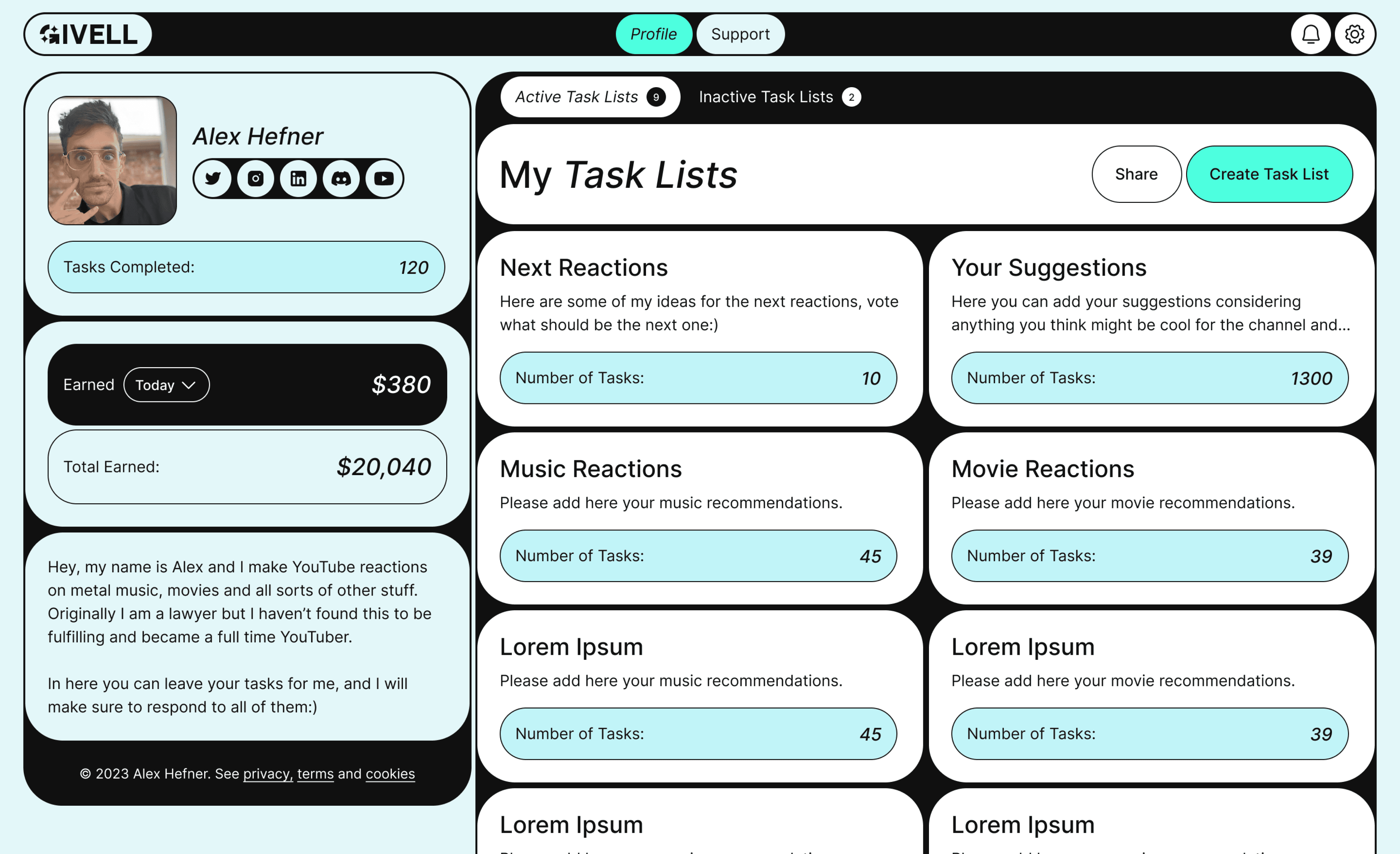
Hired and worked closely with developers, conducting design QA at each platform section to create a pixel perfect production website without bugs.

{Learnings & Takeaways}

{Learnings & Takeaways}

Our failed startup taught us that building without close user engagement leads to poor traction, regardless of positive early feedback or strong marketing metrics. Creative design alone doesnt drive conversionsusers favour familiarity and clarity. Ultimately, our value proposition didnt outweigh the switching costs, leading us to halt active development.

Our failed startup taught us that building without close user engagement leads to poor traction, regardless of positive early feedback or strong marketing metrics. Creative design alone doesnt drive conversionsusers favour familiarity and clarity. Ultimately, our value proposition didnt outweigh the switching costs, leading us to halt active development.

{

0

%

}

{

0

%

}

{

0

%

}